With spring well into should already be clear what the tones star in this new season are, but if you find yourself among the stragglers who have yet to take the time to update the style of your home, today I dedicate this small guide to know What are the colors of this spring 2016.
The protagonists
The year started with a strong predilection for strong but natural tones, all colors that can be found in nature and more specifically in gastronomy. We can pay tribute to our favorite foods and drinks as the main palette for choosing our house any of these 4 mass leaders: coffee brown, olive green, orange and peach, the winner par excellence, red wine.
 The unerring
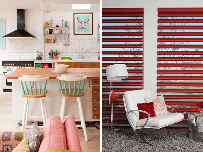
Meanwhile, with the benefit of being the basic classics that never go out of fashion, gray, black and white remain. All of them, perhaps the target with more force on the rest, can be used in two ways: either as a base shades on which add touches of color and texture, or choose the opposite solution and bet on strong tones base remaining softened by details in neutral tones. In either case, their presence is always a balance to the whole and for nothing is devoid of character
Vibrant
If we take this season to give a complete turn to the house and even guide and decoration for the summer, our ideal choice will go for happy, electrical and even fluorescent colors in some details. In this case we opted directly fuchsia, turquoise, orange, dark blue, lime green and mustard. Some may even be combined to obtain a unique style, but never forget the importance of the rule of percentages 60-30-10 (neutral-tone tone contrast-strong).
The cake
If your personal style is not limited to the use of such strong colors, you can always choose an alternative cake, which also has its presence in new trends. Of course, the decor of your home should tune in to your personal tastes, otherwise one fascia style affect your welfare. As for more relaxed palettes color, highlight for this quarter rose ice, aqua blue, yellow Custard (similar to the natural color tone Custard) and toasted brown.
The plan
The best way to apply the changes, especially if we do not have too much budget is just starting for details. The textiles or utensils are two points on which to prioritize and small touches can completely change the air in the house. Tissues should change with the passage of the cold season not only for its function shelter, but because they transmit sensations that run afoul of the new season: replace sober designs of solid color or checkered patterns or stripes bold colors and bright prints. It is important to make these changes throughout the house, not to focus on rooms with the largest textile and bedroom, but replacing carpets mats, heavy curtains for light curtains, etc., both in main rooms and passageways.
One last tip is go bet not only by artificial paint colors, furniture and decoration, but the whole dazzling display with natural colors of flowers, plants, branches, fruits or herbs. They give you a unique spring touch.


